What is a Responsive Website Builder? Microweber's Mobile Advantage
Posted on: February 06, 2025 Updated on: February 06, 2025 by Nada Allam Website development took a giant leap in the last two years. It made people interact with websites quite flexibly, and this responsive website builder turned out to be an instant need for any person who intended to enter this e-world.
In a nutshell, a responsive website builder is a must! It lets you create sites that adapt to any screen size without the experience or coding required.
Unlike regular website builders, which may require a handful of versions for different devices, responsive builders like Microweber make your site perfectly adaptable across the board.
No longer worry whether your design will be functional on a phone or tablet — Microweber does that for you!
What Are Responsive Website Builders?
Responsive website builders hold the magic of building contemporary, mobile-responsive websites.
They employ adaptable layouts that, by default, automatically adjust according to the screen size.
Microweber's drag-and-drop editor requires no coding to make your website responsive, everything is automated.
Why is this important? A responsive site is a necessity for your site's visibility, usability, and search engine optimization.
Through the flexibility and simplicity of responsive web design, users experience your site seamlessly no matter on which gadget; and yes, search engines just love it- Google in particular.
Why is a Responsive Website Essential for Your Business?
The most important thing, having a responsive site is not only about keeping pace with the modern pace but about making the company findable, reachable, and usable by the largest number of people.
While the lion's share of active users access sites on mobiles, the demand to be definite that the web application will appear and function accordingly, both on small and huge screens, increases with each day passing.
Let's talk numbers: According to Statista, in the third quarter of 2024, over 75% of retail site visits came through mobile phones, which in turn drove around two-thirds of total online shopping orders.
That is why responsive design is no longer a nice-to-have but a business imperative. Since Google moved to mobile-first indexing, having a responsive website directly affects your search engine ranking, thus becoming crucial for your SEO efforts.
The Impact of User Experience on Website Performance
The user experience is always and will remain at the top. A responsive website guarantees that your end user will have an easy time navigating your website, no matter what device they will use.
This seamless experience will keep them on your website longer, lower the bounce rates, and drive them to take the next action intended: a purchase, filling up a contact form, or signing up for a newsletter.
Mobile-First Indexing and SEO Benefits
Do you know that Google also considers the mobile version of your website as the main ranking factor? If your website is not responsive, then you are losing the opportunity to rank higher in search results.
Thanks to Microweber, because of its responsive design, you will never need to, since it automatically builds your site by default in a mobile-first approach, meaning that you're ready to rank higher and make Google happy!
Cost-Effectiveness of Using a Responsive Builder
Why invest in two websites where one will do the job? Microweber's responsive builder saves time in that you get to build one single website that fits all devices.
There would be no need to make different versions for desktops and mobiles, as everything would be conveniently easy to manage and most importantly, economical.
How to Choose the Right Responsive Website Builder?
The moment you go to select a responsive website builder, there is something you are supposed to consider. Those things include user-friendly, customizable, and feature-rich.
Microweber prides itself in being user-friendly and customizable, offering a drag-and-drop editor, many customizable templates, and SEO tools that ensure you can optimize your website for optimal use.
Essential Features to Look For
The following is what you need to look for in selecting the ideal builder:
- Drag-and-Drop Functionality: No coding necessary! Drag items around your website with ease.
- Customizable Templates: Pre-made for all screen sizes, right out of the box. Get your site's design to reflect your brand.
- SEO Tools:Built-in SEO tools to help you rank higher in search engines. Get search engines to love your website.
- Device Previews: Preview what your website will look like on mobile, tablet, and desktop before you publish it.
Understanding Your Specific Needs and Goals
Consider your website purpose for a second: what would you like your website to do? Is it a personal blog site, company web page, or online shopping website?
Regardless of the purpose, Microweber assists in making a responsive website for your unique needs.
Step-by-Step Guide to Building Your Responsive Website on Microweber
Creating your mobile-friendly website with Microweber is easier than you think! Simply follow these simple step-by-step guides, and you will get a beautiful, fully responsive website in no time, without coding knowledge!
Step 1: Sign Up and Choose Your Template
First, create an account on the Microweber website. Then, select the responsive template that suits your brand image and functionality. Microweber has loads of ready templates, and all are responsive by default.
Pro Tip: You want to be sure that whatever template you find, flows with the reasons behind your building of the site.
If yours is an e-commerce site, then you could use templates suited for online sale sites.
Or, if a blogger, template layouts that use text and picture presentation are preferable. You could preview each one to see its look on a desktop and then on mobiles.
Step 2: Customize Your Layout
With your template selected, it's time to customize. Microweber's drag-and-drop editor is extremely user-friendly. Here's how you can make it work for you:
- Add Sections: Just click the "AddSection" button to include things like text, images, contact forms, and social media buttons. Just drag the section you need onto your page, and Microweber will style it automatically for all screen sizes.
- Arrange Layout: Need to re-order where things sit? Simply drag items around until you're happy with the sequence. For instance, you can put an image block alongside a text block, or have a button below your header.
- Typography & Colors: Fonts and colors can be tailored to your brand. Modify headings, change text size, or choose a color palette you prefer.
Step 3: Add Content
With your design ready, it's time to populate it with content. From video to text to images, here's what you should prioritize:
- Optimize Images: Your images should be mobile-friendly. Microweber automatically resizes and compresses your images for quicker loading times, but it does not harm to utilize small-sized high-quality images.
- Write Mobile-Friendly Text: Keep an eye on text size. Microweber's responsive editor will render your text well on any screen, but take the trouble to split it into bite-sized pieces for comfortable reading on mobile.
- Include Interactive Elements: Insert buttons, forms, and other interactive elements. Microweber also allows you to easily insert custom code for additional advanced features.
Step 4: Optimize for Mobile
Since we are talking about responsive design, the next crucial task is to give your mobile visitors the best experience you can
- Mobile-Preview Mode: Microweber also includes an in-built mobile preview to give you an idea of how your site will look on small screens. Use this option to adjust elements that are either too large or too small.
- Spacing & Padding: Mobile space is at a premium. Microweber gives you the ability to manage padding and margins around sections to get everything just right. Reduce excessive padding or introduce some if you need to in order to make your content readable without cluttering the screen.
- Test Your Site: Once you've made mobile changes, test your site on actual devices, smartphones, and tablets. Microweber will natively reformat the layout, but it's always best to conduct some real-world testing.
Step 5: SEO Best Practices — While You Build!
One of the greatest things about Microweber is that while you're building your site, it's working to assist you in keeping SEO in check.
- Add Meta Tags: Under page settings, Microweber allows you to add meta titles and descriptions. Be sure to fill these out with relevant keywords, as this will help search engines understand and rank your site.
- Responsive SEO Tools: All your SEO efforts (including image alt tags, URL format, and internal linking) in Microweber are mobile-responsive automatically. You just add the content, and the system will do everything else.
- Speed & Performance: Mobile users need speed, so you need to optimize your files and images for quicker loading. Microweber already optimizes images in the background, but you can further compress images using third-party tools like TinyPNG before uploading.
Step 6: Ensure Compatibility Across Devices
By now your site is beginning to look complete, and Microweber makes sure that each component of it functions perfectly well on all devices. From desktop to mobile, everything functions perfectly together.
- Preview on All Devices: Microweber gives you the ability to switch between desktop, tablet, and mobile previews so you can instantly see how your content appears on varying screen sizes. This makes switching layouts for optimum usability a breeze.
- Custom Breakpoints: Should you need to get a bit more advanced, Microweber allows you to customize breakpoints — the areas where your layout adapts for each device. Don't worry, though; for the majority of users, the platform does this automatically for you.
Step 7: Publish and Test
When all is perfect, it's time to publish. Publish your site before that, however, execute that final round of testing to verify all is fine:
- Device Testing: Review your site on several devices to see if it's responsive. Remember to test portrait and landscape modes!
- Loading Speed: Utilize Microweber's performance tools to test the loading speed of your website. Your website must load fast, particularly for mobile users.
Bonus Tip: Regular Updates and Maintenance
Now that you’ve launched your responsive website, don’t let it gather digital dust! Regularly update content, test for new device sizes, and tweak any elements that need attention.
Microweber makes ongoing maintenance simple, so you can keep your site fresh without a hassle.
Conclusion
Those days are behind us when you used to worry whether your website looks good on every device. With Microweber, you can create a website that will automatically adjust to any screen size, without sweating.
No coding is required, just pure flexibility and creativity. Whether you're creating a neat business website or an active blog, Microweber gives you the tools to make it look good no matter how your users prefer to browse.
So what are you waiting for? Create your mobile-friendly masterpiece with Microweber today, and provide your users with the smooth, responsive experience they deserve!
FAQs
How often should I update my responsive website?
With ever-changing technologies and user behavior, updates on your site at least once every few months will be a good target. Can I make a static website responsive?
Can I switch to a responsive website from a static one?
Of course with Microweber, the transition from Static to Responsive will be very painless. Some industries take into consideration a huge advantage from it.
Most could, but definitely mobile-intensive sectors like e-commerce and entertainment industries are hit hardest.
Are there any specific industries that benefit more from responsive design?
Practically any industry can benefit, but mobile-heavy industries like e-commerce and entertainment are affected most.
About the Author

Nada Allam
Hello, I am Nada, a Web Content Writer at Microweber, specializing in crafting engaging and informative digital content, to ensure an exciting and intriguing website building experience.
Share this article:
Related posts
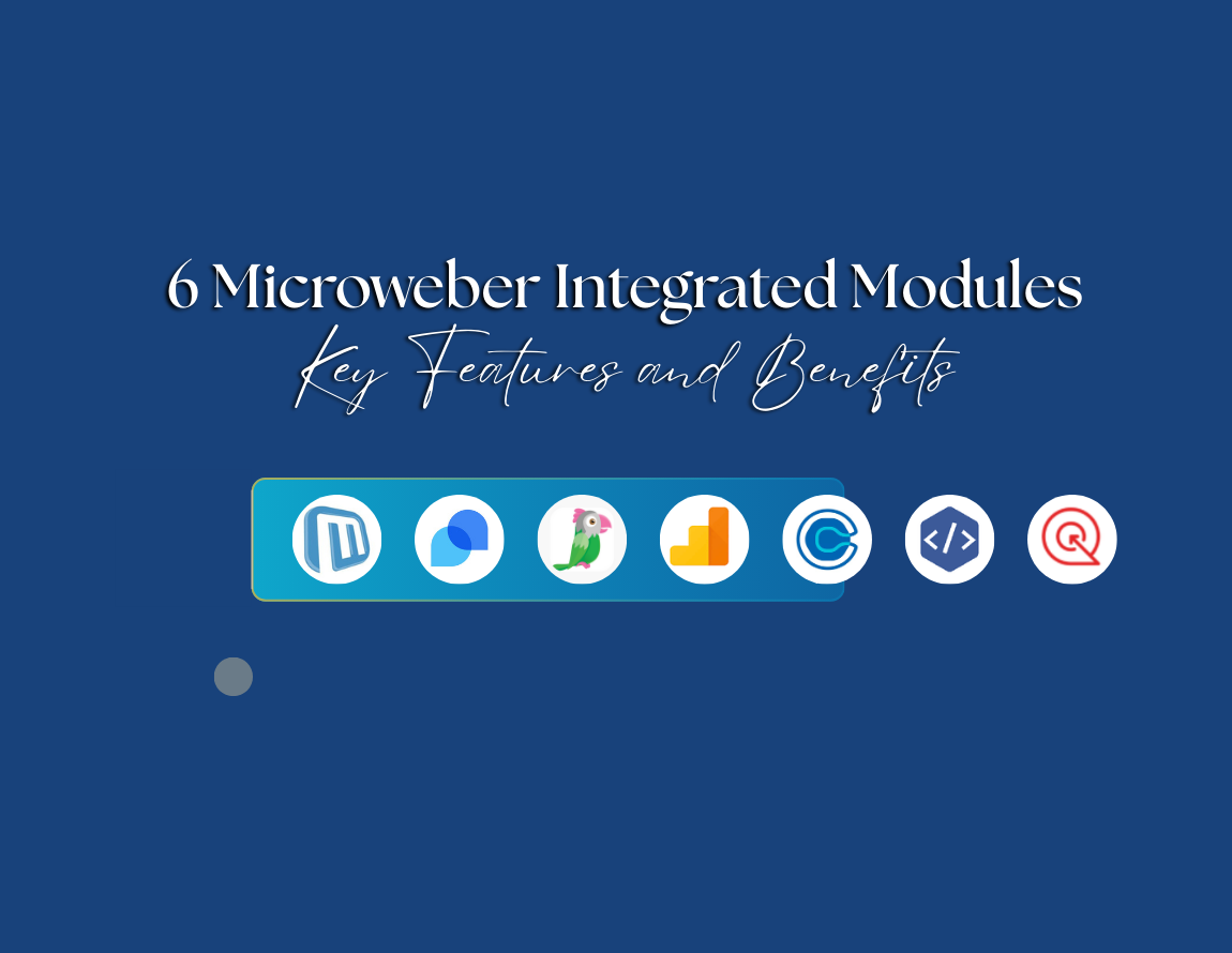
6 Microweber Integrated Modules: Key Features and Benefits
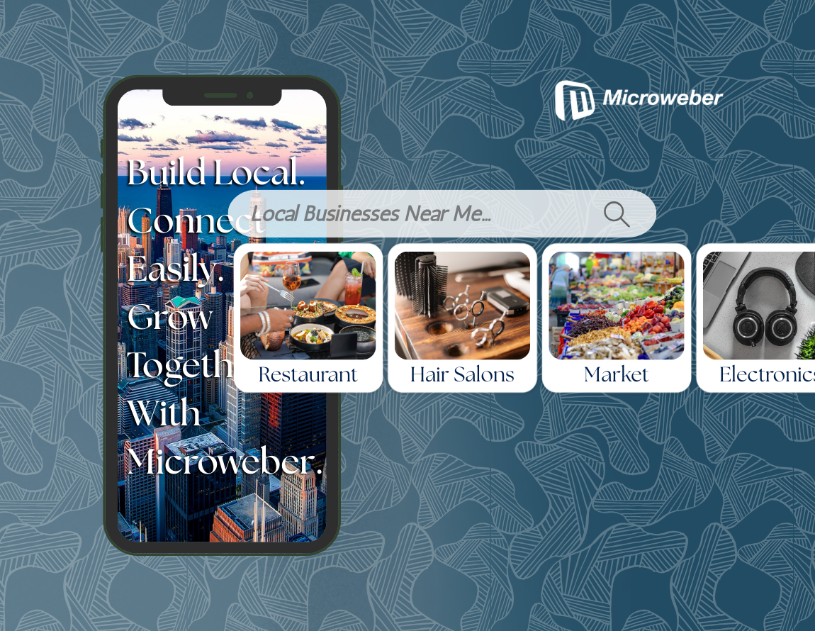
Build a Thriving Local Directory: The Easy Way to Build a Website
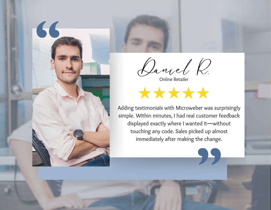
Make a Website That Builds Trust: The Importance of Testimonials

Struggling With Conversions? 5 Common UX Mistakes You Can Fix Today
Create a Simple Website with Microweber: A Guide for Non-Tech Users