Struggling With Conversions? 5 Common UX Mistakes You Can Fix Today
Posted on: May 06, 2025 Updated on: May 06, 2025 by Nada Allam Visitors aren’t just scrolling, they’re deciding. And they’re doing it quickly. A cluttered layout, a buried button, or a clunky mobile view can quietly steer people away before you’ve had a chance to show what you offer.
That’s why user experience (UX) plays such a key role in conversions. When your site feels easy, familiar, and clear, users are far more likely to stick around and take action.
If you’ve been tweaking headlines or testing colors without much change, you might be missing a few simple fixes that carry real impact. And the best part? You don’t need to know code or hire a designer to make improvements that matter.
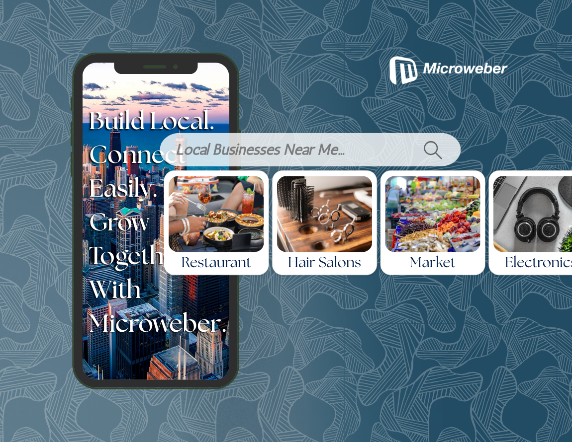
Microweber gives you the tools to build better UX by default—drag, drop, adjust, and watch the results. So if conversions are slow, now’s a good time to clean up the small details that might be holding users back. Here's where to start.
Understanding the Importance of UX for Conversions
User experience isn’t just a design concern; it directly influences how people interact with your site and whether they complete an action. When visitors land on a page, they’re deciding within seconds if it’s worth their time.
If the layout feels confusing, if actions aren’t obvious, or if things just don’t feel smooth, they’re likely to bounce.
Strong UX guides users effortlessly from interest to action. It removes friction, clarifies next steps, and builds enough comfort to support trust.
Whether someone is signing up, placing an order, or just looking for contact info, good UX makes every step easier, and more likely to convert.
Microweber users can improve UX right away by simplifying layouts, using clear calls to action, and testing mobile views.
The good news? You don’t need to be a developer to make smart improvements that actually work.
1. Identifying and Fixing Weak or Unclear CTAs
Even the best content won’t get results if users don’t know what to do next. A weak CTA doesn’t just slow people down, it might stop them completely.
That small button has a big job, and how it looks and what it says matters more than you might think.
The Role of Action-Driven Text in CTAs
This is where language does the heavy lifting. The words on your buttons should feel like a natural next step. Clear, direct phrases help users feel confident they’re heading in the right direction.
Optimal Placement and Visual Contrast for CTAs
You’ve got the right message, now make sure it’s easy to spot. Where you place your CTAs and how they look visually should guide users without them needing to search.
You can read ‘Creating a Custom Website? Here’s Where to Place Your CTA Buttons’ to understand the best placements for your CTAs.
Microweber Tip: With the built-in button module, you can test layouts and try two-button combos to guide different types of users.
2. Enhancing the Mobile Experience for Better Conversions
More than half of web traffic comes from mobile devices. So if your site doesn’t feel smooth on a small screen, you’re likely missing out. Users should be able to browse, tap, and act just as easily on mobile as on desktop.
The Necessity of Responsive Testing
You don’t have to guess how your site looks on mobile. There are easy tools, and built-in views in Microweber, that let you preview how your site performs across screen sizes.
Proper Sizing and Spacing for Mobile Users
Tiny buttons and crowded text are a fast track to frustration. Give users enough room to interact comfortably by focusing on touch-friendly design choices.
Microweber Tip: Use mobile editing mode to adjust spacing, padding, and block positions for the best possible experience.
3. Simplifying Visual Overload for User Engagement
A cluttered layout might seem full of energy, but it often leads to confusion. People don’t want to work to understand your site. They want it to guide them naturally, with a layout that’s clean and easy on the eyes.
Establishing a Consistent Visual Hierarchy
Think of your page like a conversation. Start with the most important thing, then guide users down the line. Using size, color, and layout helps shape that flow.
The Power of White Space in Design
Less really is more. Spacing things out makes your message easier to read and lets users breathe. It also helps your site feel more polished without needing complex design tricks.
Microweber Tip: Start with a clean template and use layout blocks to build organized pages without the clutter.
4. Streamlining Navigation for Improved User Experience
Getting around your site should feel simple. If users can’t find what they’re looking for, even the best content won’t help. Clean, clear navigation keeps people moving, and makes them more likely to convert.
Reducing Top Links for Simplicity
Too many options can slow users down. Keep your main menu focused, with just a few clear choices. This makes your site easier to scan and faster to use.
Creating Clear and Consistent Labels
Avoid vague menu items or insider terms. Use labels that say exactly what the user can expect, no guesswork required.
Microweber Tip: Try sticky headers and the menu module to keep things clean and consistent from page to page.
A clearer tip? Follow these 10 Microweber Tips to Perfect Your Business Website Design!
5. Incorporating Trust Signals to Boost Credibility
People don’t always buy from the best site, they buy from the one they trust. Without trust signals, even a great design can fall flat. Showing users that others believe in you adds a layer of reassurance that matters.
Utilizing Testimonials as Trust Signals
A few kind words from a real customer can go a long way. Use quotes, star ratings, or even short video clips to let your happy users speak for you.
The Importance of Visibility in Contact Information
If users have questions or want to reach out, they shouldn’t have to dig. Contact details should be visible and easy to find, this builds confidence fast.
Microweber Tip: Use testimonial carousels or repeat a contact bar across your site for consistency and reassurance.
Conclusion
Conversions don’t always come down to what you offer, it’s often how easy you make it to say “yes.” By addressing these common UX mistakes, you're not just improving design. You're making it easier for real people to interact with your content, trust your message, and take the next step.
Microweber makes these updates simple with tools built for non-technical users. You don’t have to guess what’s working. Just test, adjust, and see the results in real time.
Try Microweber today and see how easy it is to build a site that works smarter.
FAQs
What factors affect conversion rate?
Speed, mobile experience, CTA quality, trust signals, and how clearly your site guides users all play a role.
Why user experience matters for your conversion rate?
A better experience reduces confusion and encourages users to take action, which leads to more conversions.
How to fix these UI/UX mistakes?
Focus on simple, direct design updates. Microweber makes it easy to adjust visuals, structure, and content quickly.
About the Author

Nada Allam
Hello, I am Nada, a Web Content Writer at Microweber, specializing in crafting engaging and informative digital content, to ensure an exciting and intriguing website building experience.
Share this article:
Related posts

6 Microweber Integrated Modules: Key Features and Benefits
Build a Thriving Local Directory: The Easy Way to Build a Website

Make a Website That Builds Trust: The Importance of Testimonials

Struggling With Conversions? 5 Common UX Mistakes You Can Fix Today

Create a Simple Website with Microweber: A Guide for Non-Tech Users