Microweber: The Free Mobile Website Builder Changing the Game
Posted on: March 05, 2025 Updated on: March 05, 2025 by Nada Allam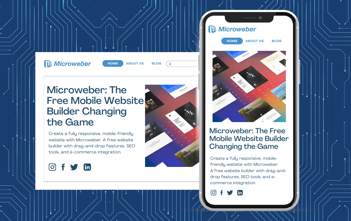 A slow, non-responsive website will drive visitors away the moment they arrive. With mobile web browsing the new norm, having a website that responds smoothly to whatever device visitors are using is crucial.
Microweber makes life simpler. This website builder puts mobile-first design first, providing a drag-and-drop system, native responsiveness, and robust commerce capability.
Most other programs create for the desktop first, then convert them to mobile. Microweber defaults to the creation of mobile compatibility.
As mobile usage grows further, websites that fail to heed the rules of mobile-first will suffer reduced engagement and search rankings.
Microweber makes it easier to create an instant, usable, and beautiful website with no code to write!
Understanding Mobile-First Design
As we move through the landscape of web design, it's vital to be aware of the concept of mobile-first design.
This approach prioritizes the design specifically for mobile devices initially and then scaling to larger screens to deliver the best possible experience to every platform.
Defining Mobile-First Design
Mobile-first design is an approach that begins the design process from the mobile. With the limited real estate that the screens offer, designers are concerned about the core content and functions to ensure there is use and clarity.
As the design then scales to the tablets and the desktop, secondary functions can be added to the core experience without diluting it.
The Evolution and Necessity of Mobile-First Design
The surge in mobile usage has digitally altered the landscape. Over 75% of retail web traffic came through mobile phones and contributed to about two-thirds of the overall online orders.
This shift makes having a mobile-first strategy crucial to meeting users' expectations and keeping pace.
Mobile-First Design vs. Traditional Design Approaches
Traditional design strategies usually began top down: designs created on the desk that then got hacked down to the screens. This produces clunky and wasteful mobile experiences.
Mobile-first design does the opposite: the essential user experience is created specifically for the mobile user, that means cleaner, more efficient designs that are usable anywhere.
Identifying the Target Audience for Mobile Websites
Understanding who your mobile users are will be crucial to successful design. Mobile users are often seeking fast information that is convenient to them and will use your site differently than desktop users.
Mobile users are alike but are diverse in the sense that they desire quick information availability, easy navigation, and fast-loading pages.
Realizing these tendencies makes designers design something that will appeal to the mobile community.
By prioritizing the users' necessities like convenient navigation, legible copy, and fast loading times, designers can create mobile websites that both appeal to users and engage them.
This user-focused strategy is the core principle in the modern mobile age.
The Strategic Importance of a Mobile-First Approach
Adopting a mobile-first strategy has numerous advantages that range from enhanced SEO performance to enhanced user experience.
Statistical Insights: Mobile User Growth and Website Traffic
The consistent growth in the use of mobile devices emphasizes the need to ensure that there are mobile-accessible websites.
Organizations that meet this are likely to see higher engagement and conversions.
SEO Benefits of Adopting a Mobile-First Strategy
Search engines, like Google, prefer mobile-compatible websites to rank them. With mobile-first design, the website will be easily viewed and will receive more organic traffic.
The Role of Mobile-First Design in Improving Accessibility
A mobile-first strategy has built-in accessibility that makes the site usable to every type of user regardless of the capability or the device.
Microweber: A Mobile-First Website Builder
 With the growing popularity of mobile browsing, mobile-first design has to be the primary concern for website developers.
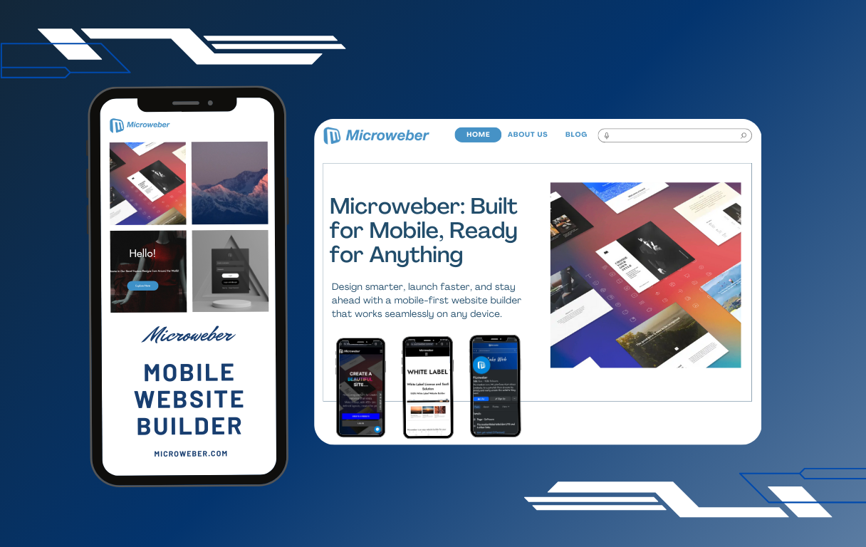
Microweber does this truly, providing an unobtrusive, seamless tool that makes website creation simpler on the mobile.
Microweber develops your website mobile-ready from the start, giving visitors an unbroken experience on each machine.
Microweber as a Mobile-First Website Builder
Microweber is an open source web construction tool and CMS that provides the capability to create fully responsive websites without writing code.
Most website builders that employ desktop-first designs where the mobile optimization comes last are the exact opposite. Microweber does the opposite: mobile responsiveness from the beginning.
Why Microweber, you may ask?
Drag-and-Drop Simplicity: Microweber has an interface that provides the capability to create your website through visual means using the drag-and-drop technique. This makes it easier to create mobile-friendly designs without writing code.
Built-in Responsiveness: The built-in responsiveness within every component and template that is included within Microweber automatically responds to different sizes of screens. The users are not required to manually tweak the settings to be mobile-compatible.
Optimized for Performance: Mobile users prefer fast-loading websites. Microweber optimizes the layout, script, and imagery to load the website quickly to allow seamless browsing.
Mobile-First Templates: The website has a series of themes and templates specifically designed keeping the mobile users in view to ensure seamless compatibility on tablets and smartphones.
E-commerce Integration: The intention is to sell online, there's an integrated e-commerce system that's mobile-compatible to allow users to manage shops and process payments anywhere.
Implementing a Mobile-First Design with Microweber
Microweber makes the mobile-first strategy easier to use through an efficient process that supports users.
Here's how to unlock an enhanced mobile experience via Microweber:
1. Prioritizing Content for Mobile Users
Mobile users scan rapidly to find the vital information that has no unnecessary distractions. Microweber assists users to rank their vital content through:
- Encouraging clear, understandable writing using easily legible fonts.
- Supporting collapsible menus and hierarchical navigation to aid accessibility.
- Allowing for one-click call-to-action buttons to create higher clickthrough.
- Offering built-in SEO options to help optimize mobile search rankings.
2. Designing with Small Screens in Mind
A mobile-first website will be stunning and run smoothly on the small screens. Microweber offers the means to guarantee that your website will be experienced to the full on mobile:
Touch-Friendly Elements: The navigation links, buttons, and forms are made tappable simply to prevent the users from being annoyed.
Flexible Grid Layouts: Microweber layout system fits perfectly to the screens of different sizes, keeping the information properly organized and legible.
Image and Video Optimization: The system dynamically resizes the media files to the devices to ensure maximum performance without compromising the quality.
3. Progressive Enhancement for Larger Screens
Starting with a mobile-first foundation does not necessarily mean to overlook the large screens.
Microweber ensures that as the users transition to tablets or desktops, the experience does not collapse:
Expandable Menus & Navigation: The menus are made to be conveniently used on tablets and smartphones and expand to be accessed on larger screens.
Additional Features to Computer Users: Computer users are given richer visualisations, animations, and complex functions, whereas the mobile users are given a simpler but lovely one.
Automatic Screen Adaptation: The layout of the content automatically adjusts to the device to produce fluid transitions from mobile to large screens.
4. Tools and Technologies for Effective Mobile-First Design
Microweber incorporates a range of built-in tools and technologies to allow users to produce premium performing mobile websites:
Live Editing: The users can make real-time website edits to understand how the layout will be viewed on the mobile.
SEO Tools: The built-in SEO functions guarantee that the mobile-supportive pages are well-ranked within the search engines.
E-commerce Optimization: Online shops are supported through Microweber’s mobile-compatible checkout system that improves conversions and decreases cart abandonment.
Performance Tracking: Google Analytics integration and other tracking tools allow users to monitor the behavior of mobile users and optimize accordingly based on the information.
Microweber simplifies website building to be mobile-first to offer users a convenient means to create fast, responsive, and stunning websites with zero tech expertise.
Future Trends in Mobile-First Design
The digital marketplace keeps developing, and to remain current, you have to track the latest trends.
Anticipating Changes in Mobile User Behavior
As technology develops, user behavior changes. Understanding this shift helps designers innovate and evolve to remain relevant and engaging.
Emerging Technologies and Their Impact on Mobile-Web Strategies
Technologies like 5G, artificial intelligence, and augmented reality will redefine web experiences on mobile. The convergence of the technologies has the potential to deliver users more interactive and richer experiences.
Conclusion
A mobile-first strategy is no longer an option, it's essential to create an ideal user experience, enhance search rankings, and stay competitive within a mobile-first world.
Microweber makes this simpler to accomplish, making it an uncomplicated method to produce a fast, responsive, and stunning website that does not need tech expertise.
With its native sensitivity, drag-and-drop functionality, and mobile-optimized options, Microweber has your site covered to best utilize the mobile users of the current age.
Whether launching a blog about yourself, a business website, or an ecommerce website, Microweber has the capabilities to allow you to prosper.
Start building your mobile website today using Microweber!
FAQs
What is Mobile-First Design?
Mobile-first design is an approach that starts from the start, using the mobile devices to design the best possible experience possible on the limited screens to then adapt to larger devices.
Why is mobile first important?
With the majority of people using the web via mobile devices, a mobile-first strategy gives the assurance that the websites are meeting the users' expectations and are performing optimally on each medium.
Should I design my website from mobile first?
Yes, designing the website based on the mobile-first strategy gives the identical user experience to each device, enhances the ranking for SEO, and adheres to the best web design principles.
About the Author

Nada Allam
Hello, I am Nada, a Web Content Writer at Microweber, specializing in crafting engaging and informative digital content, to ensure an exciting and intriguing website building experience.
Share this article:
Related posts

6 Microweber Integrated Modules: Key Features and Benefits
Build a Thriving Local Directory: The Easy Way to Build a Website

Make a Website That Builds Trust: The Importance of Testimonials

Struggling With Conversions? 5 Common UX Mistakes You Can Fix Today
Create a Simple Website with Microweber: A Guide for Non-Tech Users