10 Practical Tips to Create a Responsive Website in Microweber
Posted on: April 18, 2025 Updated on: April 18, 2025 by Nada Allam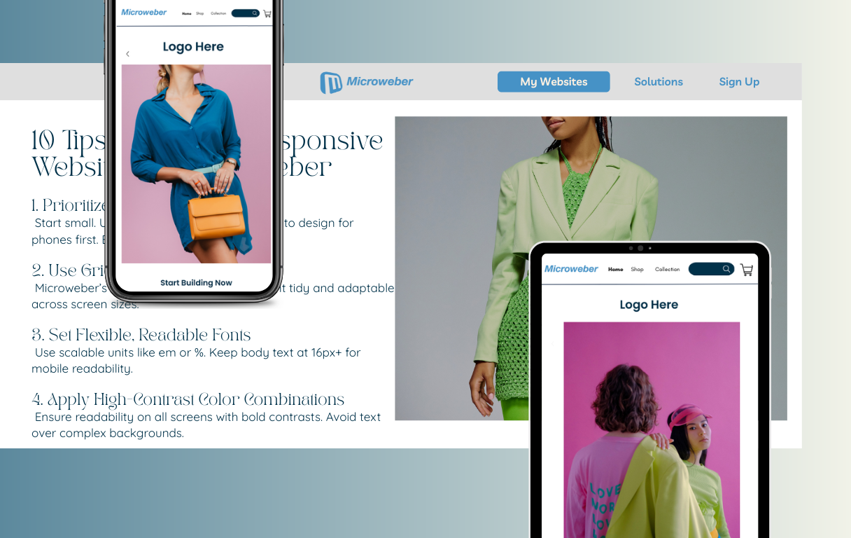 Today's communications and commerce are headed towards mobile-first technology, as such, you must create a site that seamlessly integrates into any device in order to retain your followers.
Responsive design implies your site offers an optimal experience whether browsed from a desktop computer, tablet, or smartphone.
Microweber's ease of use offers an unimpeded process in creating such a website due to its powerful tools.
By abiding by the best practice for responsiveness, you can ensure your homepage is optimized for appearance and function across all screen sizes, enhancing user experience and maximizing site performance.
Understanding the Importance of a Responsive Homepage in Microweber
The responsiveness of any site is paramount to its success for use across all devices.
A responsive home page automatically adjusts to mobile phones, desktops, and tablets, allowing your readers an easier time accessing your content.
The Role of Microweber in Building User-Friendly Experiences
Microweber's drag-and-drop responsiveness puts responsive web design at your fingertips.
Microweber's platform is designed to assist content creators, developers, and smaller businesses achieve awesome, functional sites in an efficient manner.
With responsive elements already embedded and mobile-first optimizations, Microweber spares you frustration and allows you to build accessible experiences that look stunning on every device.
Benefits of a Mobile-First Approach for Business Growth
In an era of mobile-first browsing, mobile-first design can prove to be the key to business success.
The mobile-first design establishes your website as optimized for small screens and delegates scaling to larger screens.
Not just better for user experience, mobile-first design also leads to better ranking in terms of SEO as Google prefers responsive websites.
When you prioritize mobile audiences, you also build an intuitive user interface for better engagement, conversion, and user access.
1. Kickstart Your Design with a Mobile-First Layout
Mobile development leads to clean, scalable design. Microweber’s preview device feature allows you to see your site just as it’ll look on mobile all the way through to its scaling in tablet and desktop versions.
In doing so, you achieve the right mindset for prioritizing the most critical items -e.g., calls to action, nav bar, and essential content- into position and placing them at the forefront of smaller screens.
When you optimize for mobile first, you guarantee that you have uncluttered interpretation as the design scales out to larger screens.
2. Implementing a Structured Grid System for Content Organization
Your website needs to have a well-designed structure for it to be responsive. Microweber's grid structure (rows and columns) enables you to organize your contents in an organized fashion so that they do not appear disorganized or misplaced in different sizes of screens.
For example, when placing contents in rows and columns, Microweber adapts automatically to mobile screens.
In smaller screens, such columns can be stacked upon each other for convenient reading.
Microweber's responsive grid structure scales your design without losing its perfect appearance despite its viewing device.
3. Set Scalable, Legible Fonts Across Devices for Better Accessibility
Typography is at the core of webpage usability, and making sure they remain legible on different devices is an absolute must.
With Microweber, you can set font sizes to scale using relative measurements like em and percentages, rather than fixed pixels.
This makes font scaling consistent on different screen resolutions. Additionally, keep the body font at least 16px for mobile viewing.
Microweber typography features make adjusting font sizes at different breakpoints easy, so your text remains always legible and readable from mobile to desktop.
4. Enhancing Readability with High-Contrast Color Schemes
The right choice of color is key to readability, especially in mobile views because readers may not be in a position to read small fonts against busy backgrounds.
Microweber has diverse color schemes so you can choose high-contrast color combinations such that your words can easily be read.
Apply contrast background and text color to increase your website's readability, especially in sections such as headings and calls to action buttons.
Consider overlays in images when you overlay words against backgrounds for extra contrast.
This simple step enhances readability and user interaction.
5. Tweaking Layout Control with Margin and Padding Tools
Adequate spacing is key to a clean and intuitive interface. Microweber's padding and margin modules offer complete flexibility in terms of spacing.
Padding within sections and margins among sections prevent content from becoming cramped in too little space, and this is useful for touch-based navigation on mobile.
You can eliminate wasted space in mobile and optimize for better balance in desktop.
It creates a visually pleasing homepage that is convenient to navigate regardless of device.
6. Incorporating Scalable Images to Maintain Visual Quality
Imagery is an essential part of any website, yet can slow down loading times, if not optimized.
In Microweber, resize photos out to 100% so they adapt automatically to different screen resolutions without affecting the layout. This is especially important when using large hero graphics or product pics.
Compress pictures to reduce files to keep loading speedy, a consideration especially for mobile surfers, who have slow connections.
In Microweber, upload and scale pictures effortlessly without losing image quality.
7. Breaking Up Content for Better User Navigation and Engagement
Long blocks of content can be intimidating for smaller screen sizes. Break your content into bite-sized chunks for easier use.
Structure your content using headings, subheadings, bullets, and pictures to make your content skimmable.
You can also visually distinguish such blocks in Microweber by applying background coloring or dividers so that everything remains in line and is easy to read.
Chunking and summarizing your content becomes even more important on mobile because your customers won't read large blocks of content.
8. Utilizing Responsive Menu Modules to Enhance Navigation
Navigation is an integral part of any website, and acing mobile navigation is crucial.
Microweber offers responsive menu modules, which automatically adapt for desktop, tablet, and mobile.
Microweber converts the regular navigation menu into a hamburger menu in mobile mode, which offers you extra space and an improved user experience.
Keep your menu easy to navigate across all screen sizes, and always test for different devices so your menu works flawlessly.
9. Boosting Performance by Minimizing Load Times
Not only should a responsive website look good, but it should also load quickly. Slowness can increase bounce rates, and this becomes particularly noticeable when mobile customers may be using slow internet connections.
Microweber includes image compression and lazy loading, a function that loads images only once they become visible.
This reduces initial loading time and overall site speed. Also, refrain from loading too heavy modules and external scripts which slow down your website.
10. Test Responsiveness Frequently Using Microweber Preview and Browser Tools
One of the key processes in developing a responsive site is testing. Microweber's preview mode allows you to view your site's structure instantly on desktop, mobile, and tablet.
Every now and again have a look at how elements like graphics, text, and navigation react for different breakpoints.
For further testing, use browser developer services like Chrome DevTools or online utilities like Screenfly to test for consistency in different environments.
Occasional checking gets your site functional and attractive to all devices.
Conclusion
One of the finest ways to give your customers an optimum experience regardless of what device they use is by having a responsive website.
With Microweber's intuitive software and uncomplicated features, you can use the following principles to build a site capable of accommodating any screen size.
With mobile-first design, slimmed-down content, and fast loading, you can build a homepage that is working for your business and customers.
Get started creating your responsive site using Microweber today and give your customers a professional, high-quality experience on any device.
FAQs
Why is a responsive website essential for your business?
A responsive website gives your customers the optimum experience no matter what device they use, boosts search engine ranking, and lowers bounce rates, all of which translate to growing conversion rates and better customer retention.
How to choose the right responsive website builder?
Look for a platform that provides mobile-specific functionality, usability, and design flexibility. Microweber is a great choice for creating responsive websites with no need for deep coding skills.
How to make UI more responsive?
Use fluid grids, flexible fonts, and responsive module layouts. Test continuously across devices and breakpoints to ensure UI adjusts appropriately to screen size.
About the Author

Nada Allam
Hello, I am Nada, a Web Content Writer at Microweber, specializing in crafting engaging and informative digital content, to ensure an exciting and intriguing website building experience.
Share this article:
Related posts

6 Microweber Integrated Modules: Key Features and Benefits
Build a Thriving Local Directory: The Easy Way to Build a Website

Make a Website That Builds Trust: The Importance of Testimonials

Struggling With Conversions? 5 Common UX Mistakes You Can Fix Today
Create a Simple Website with Microweber: A Guide for Non-Tech Users