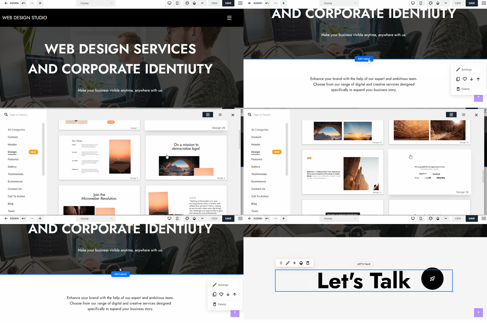
We're excited to announce that the new "Design" category has been officially launched in the BIG Template with the release of Microweber version 2.0.13. Microweber, renowned for being an open-source website builder and CMS, empowers users to freely download and deploy it on their own servers. You can access the downloadable version by visiting Microweber.org.
Furthermore, the Design category takes center stage on the Microweber.com SaaS solution website, extending its availability to all our valued customers. Let's delve into the enticing layouts showcased in this new category and explore the myriad features they offer. Join us as we uncover the intricacies of these fresh designs and unlock their full potential. The layout below is Layout (Design 21)
Introducing 26 dynamic new designer layouts featuring captivating animated elements. Picture this: testimonial blocks that elegantly shift, or how about an arrow effect that gracefully ascends upon hover, as showcased in the gif above.
The Design category is brimming with such impressive effects. We're confident that these enhancements will elevate your website creation experience with Microweber, allowing you to craft even more impactful and visually stunning websites.
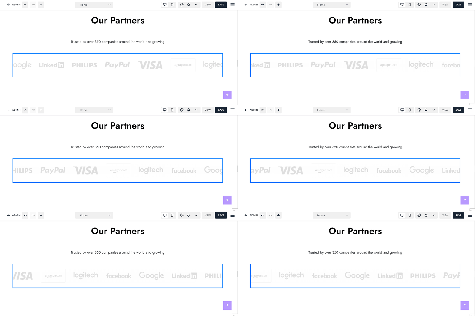
Let's explore another example below of moving logos using this Layout (Design 09).
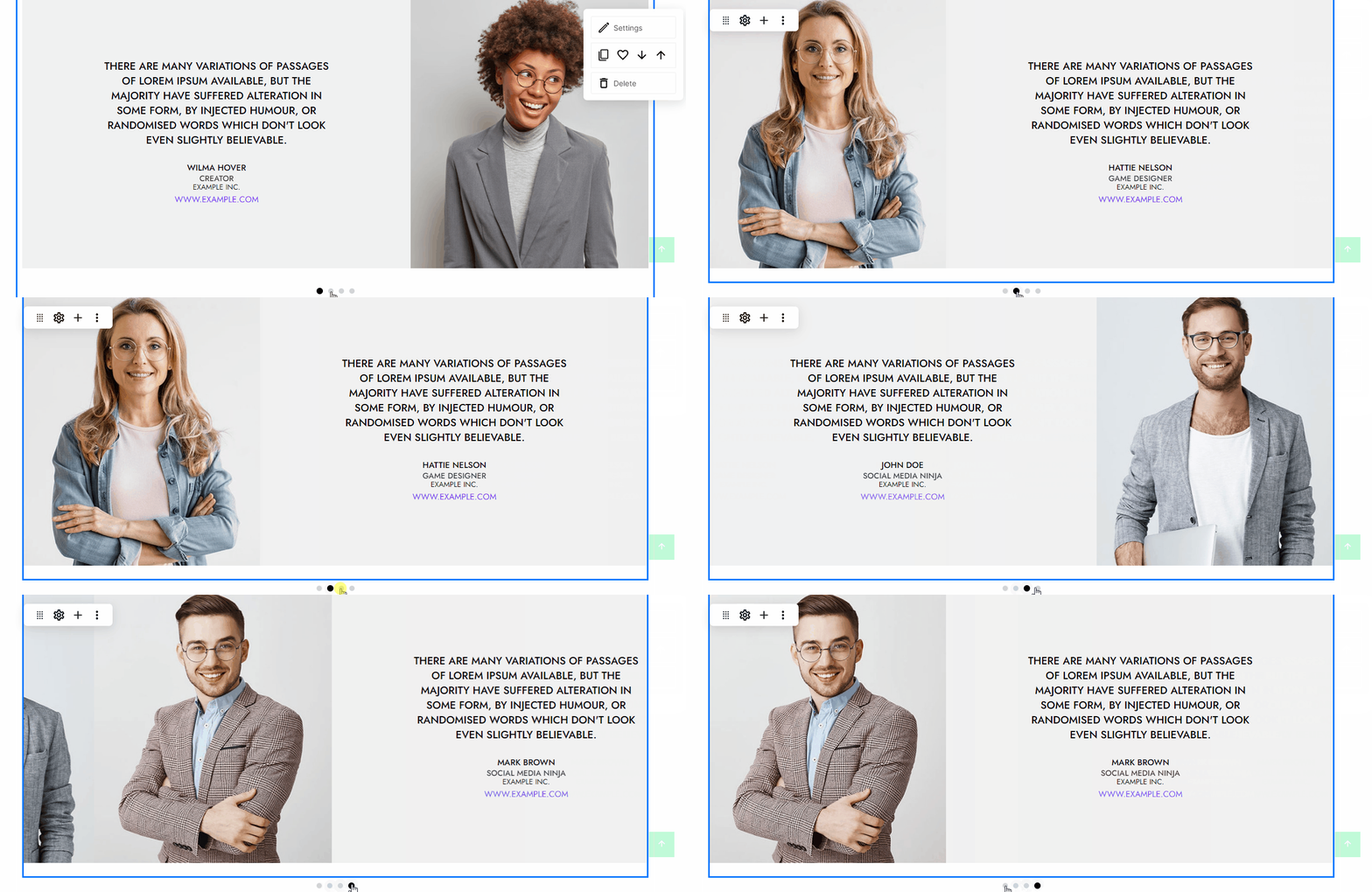
Another great example of effective layout block with slider is the new Testimonials layout (Design26) skin. By using it, you are giving the users who's browsing your website a good view of testimonials your customers leave. The slider skin contains image of the client, text of the testimonial, client name, company name and position, and website.
Part of the moving elements is also the "Marquee" module. It is not part of the layouts or any layouts category...this is a module. You can add it very easily when you are working on Live Edit mode. Just click on the "+" icon to open the modules modal and in the search field, and type "marquee". After you choose it, it will appear on the webpage. Here is how it looks.
Marquee module preview
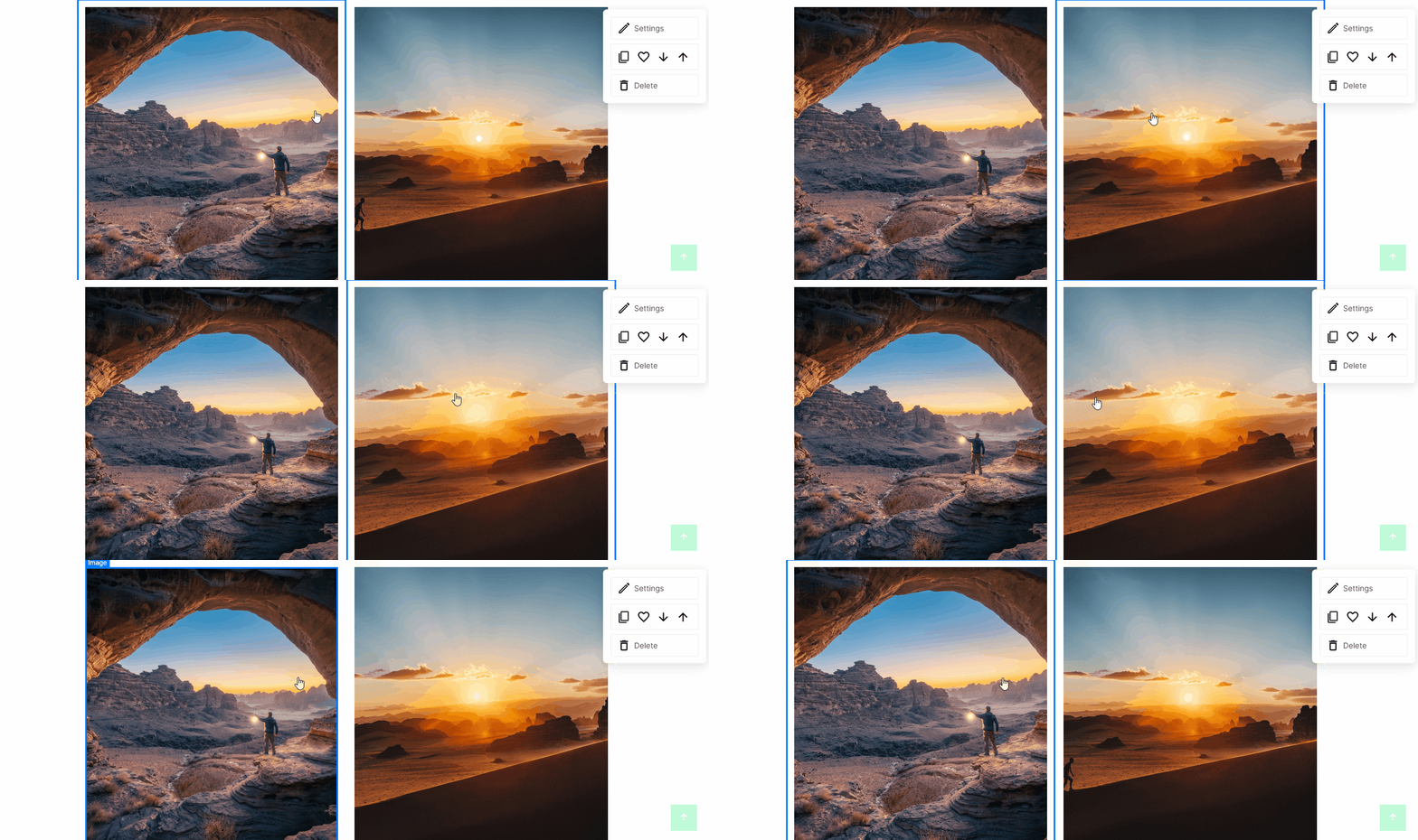
This layout (Design 15) comes with a picture gallery with a simple Zoom effect on hover. It's excellent to show some cool images or present a portfolio. In any case, it can be used for presenting something with a simple effect.
Finally, we're excited to introduce Design 25: our dynamic team slider. With its seamless animation transitions and elegant 2-column grid, this layout is ideal for showcasing testimonials or highlighting key team members. Its versatility ensures impressive results, whether you're presenting testimonials or featuring your team.
In conclusion, leverage the Design category to enhance the allure and engagement of your website. You are the real designer now; use your creativity and fearlessly experiment with the layouts.
What's even better? Every layout is optimized for mobile devices, sparing you the hassle of worrying about how your webpage will appear on smaller screens.
But wait, there's more! Dive into the settings of each layout to maximize their visual impact.
Thank you for exploring. Dive into Microweber's new Design category today and share this article!
