Creating a Custom Website? Here’s Where to Place Your CTA Buttons
Posted on: April 10, 2025 Updated on: April 10, 2025 by Nada Allam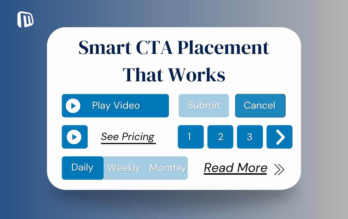 You've built an amazing website with excellent content, but it just does not feel finished. What it is possibly missing is the Call-to-Action (CTA) button, that distinct feature that invites users to the following action.
Be it subscribing, buying, or knowing more, CTA buttons are necessary in order to boost the interaction as well as conversions of users.
It is not just about placing the button, however. For effectiveness, a CTA needs to be carefully designed as well as placed.
It should be visible but not in the way, in places where users are most likely to act, and should employ words powerful enough to trigger action.
Done well, CTAs offer users an end-to-end journey, guiding users through your website.
With tools like Microweber, one can develop a site that has the ability to transform passive viewers into active participants.
Understanding the Role of CTA Buttons in Web Design
Call-to-action buttons are essential in the design of any website because they encourage users to do something and convert.
Call-to-action buttons drive users to action, like subscribing to an email list, buying, or requesting more information.
CTAs, strategically placed, drive users to the next step in addition to a quality experience.
Defining Call-to-Action (CTA) Buttons
A CTA button is interactive and is specifically designed to nudge users to do something. It could urge them to make a purchase or subscribe to the newsletter, read more about some service, for example.
Both the text of the button as well as the visual representation are important, but so is placement.
An ideal-designed button will serve its purpose if users can’t see it or are not certain what action they are being asked to take.
The Importance of Effective CTA Placement
While the visual appearance of your CTA is important, placement can be the difference between success and failure.
If your button is concealed or inappropriate for the content it's being placed in, it will be ignored.
However, CTAs in the right places can drive plenty of user interaction and lead to higher conversions.
For Microweber users, putting CTAs in their most effective locations is the secret to driving visitors where you need them to go.
If you wish to push leads, bring attention to your content, or close sales, having CTAs in their proper places means users are constantly guided toward your objective without intrusion or overstimulation.
Identifying Key Areas for CTA Placement
 When you are developing your website with Microweber, it’s critical to determine the best places for CTA buttons.
Here are key locations where CTA buttons can be most effective:
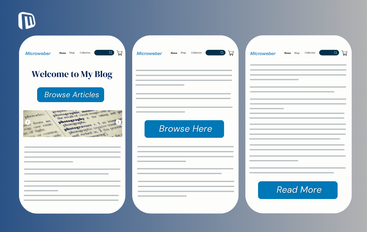
Homepage: Your home page is likely your site's initial impression on your users. CTAs on it can encourage users to get in-depth details right away.
For immediate attention, position CTAs above the fold, where users see them as the page opens.
Landing Pages: As landing pages are for your conversions, your Call-To-Action buttons should be center stage, resonating with the intent of the page.
Make your CTA clearly visible but not overwhelming the main content.
Blog Posts: Blogs are meant to give useful content, but they are great sites for inserting CTAs as well.
Put them towards the end of posts or even halfway through, inviting users to take the following step, subscribing for updates, purchasing a product, or continuing for suggested information.
Analyzing User Behavior
However, knowing the way your visitors navigate your website is very crucial in deciding on where to put your CTA buttons.
Google Analytics and heatmaps can also tell you where your visitors are lingering the most and where on your site they are interacting most.
Above the fold: People tend to interact with CTAs placed above the fold more so because they don't need to scroll down to see them.
Mid-content: Most users prefer taking action following the reading of some content. Placing your CTAs in the middle of your content, or following a specific section, will get them to do the job.
End of content: The bottom of an article or landing page is an excellent position for the final CTA. It is placed at the end after users have read everything in between.
Positioning CTAs Within the Content
Put your CTA buttons in line with the natural flow of your content. Guide your users towards action at natural stopping points, such as after scrolling through the solution to a problem or after presenting a compelling argument.
Note the following:
Top of page: An above-the-fold call-to-action at the top page captures users at once and makes them take action immediately
Mid-content: Having a CTA in the middle of content allows users to act after having absorbed parts of the content
End of content: The final position for an article or landing page is the best location for a last Call-to-Action, prompting users to act after they have read the content.
Step-by-Step Guide to Placing CTA Buttons for Maximum Impact
To ensure your CTA buttons are effective, it is extremely important that you do it tactically.
By having a clear definition of your goals, identifying your audience, and aligning both where you place and how you place your CTAs, you can make them much more effective and achieve the desired performance.
Step 1: Identify Your Goals and Target Audience
Before you include any call-to-action buttons, spend a moment figuring out what you want your visitors to do.
Are you looking for leads, product sales, or subscriptions? Your call-to-action placement and visuals should be driven by your goal.
Understanding your audience's behavior and what they like will assist you in designing a call to action that will appeal to them.
Step 2: Design Your CTA for Maximum Impact
Your call-to-action should be clear but fit in with your overall branding.
These are what you should consider:
Text: Make it action-oriented and concise. Utilize action verbs such as "Get Started," "Sign Up Now," or "Learn More."
Color: Select a color that is noticeable but not in conflict with your whole site's design.
Size: Place the button so that it is noticeable but not intrusive on the page. Big enough so that it can be seen but not so large that it dominates the rest of the page.
Step 3: Select an Eye-Catching Color Scheme
Your color for the CTA can be successful or not depending on what you use. Use a color that is opposite your background color, but it can be in your site's color scheme.
Red, green, and blue are colors that work but experiment with shades before choosing what will work for your site.
Step 4: Determine Optimal Button Size and Shape
Your call-to-action button must be the correct size. Too small, it can be skipped over; too big, it can be overwhelming in the presence of other content. Rounded-edge buttons are more inviting, encouraging clicks.
Step 5: Position Your CTA Buttons Strategically
CTAs should be positioned where users are most likely to act on them. Try placing them above the fold, content-rich side, or at the end of an article.
It is simple with Microweber's drag-and-drop feature to try out the different placements for your buttons in an attempt to see what converts for your users.
Step 6: Create a Sense of Urgency
Users can be motivated with urgency. Apply phrases such as "Limited Time Offer" or "Only 5 Left" in order to create urgency.
Countdown timers can be applied as well in order to drive rapid choices. But ensure the urgency is legitimate in order to keep users trusting you.
Step 7: Optimize for Mobile Users
Mobile optimization is required. Make your call-to-action buttons easy to tap on your smaller screens.
Make buttons at least 44px x 44px in size and place them in the thumb area (usually towards the lower center of the screen) for easy use.
Microweber mobile optimizes your website automatically but ensure that you check how buttons appear on various devices.
Step 8: A/B Testing Your CTA Buttons
A/B testing allows you to compare one factor at a time, like text on buttons, color, or position, in hopes of figuring out what does the best job.
By monitoring click-through rates along with rates of conversion, your CTAs can be optimized for peak performance.
Constant testing will keep your CTAs functioning in the long run.
Design Elements That Enhance CTA Effectiveness
To make your CTAs stand out and trigger action, it is necessary to focus on certain key elements of design that not only attract attention but also create a better user experience.
Good design lets your CTAs function properly as well as be beautiful-looking.
Utilizing White Space for Clarity
Leaving space for your CTA button will make it prominent and remove visual clutter so that users can focus on doing the action you need them to do.
Incorporating Animation or Hover Effects
Including subtle hover effects or animations such as a color change of the button on hover can make your call-to-action dynamic as well as interactive, enticing users to click on it.
Common Mistakes to Avoid When Placing CTA Buttons
Avoiding such critical pitfalls in designing CTAs as well as their placement makes your website easy to use as well as convert efficiently.
Overloading with Multiple CTAs
Too numerous CTAs on one page can confuse users as well as weaken their impact. Opt for just one or two prominent CTAs on each page that can guide users smoothly.
Neglecting Accessibility Standards
Make your CTA buttons available to everyone, including people with disabilities. Provide descriptive text for screen readers and make buttons simple to click on.
Analyzing and Improving CTA Button Performance
Continuously optimizing your CTA buttons based on performance data and user feedback is the way to achieve higher conversion and engagement.
Using Analytics Tools to Track Click Rates
Analytics tools like Google Analytics keep track of how often your call-to-action buttons are being clicked, providing valuable insights into designing and placing buttons.
Gathering User Feedback for Continuous Enhancement
Gathering feedback through contact forms or surveys can provide insight into how you can make your CTA buttons even better in terms of meeting users' expectations and encouraging action.
Conclusion
CTA buttons are not just visual elements but significant features for triggering user action and conversions.
Strategically placed and designed, they guide users through activities like purchasing a product or subscribing to a list, for the benefit of overall user experience.
By targeting placement, layout, as well as crystal clear action-oriented words, you can get your call-to-action buttons effective at initiating action.
Microweber is one among the options for simple deployment as well as optimization of buttons for optimal effectiveness in initiating action on your website, turning visitors into active contributors to your website
Ready to boost your site's engagement? Start making effective CTAs with Microweber today!
FAQs
What is a CTA button?
A Call-to-Action (CTA) button is an interactive web element designed to guide users into performing an action, for example, signing up, buying, or learning about a product.
What is the difference between a button and a CTA?
A standard button can do numerous things, such as submit a form or lead you elsewhere on the page. A CTA button tells users explicitly what they should do to achieve an objective.
Where to place CTA buttons?
Place your call-to-action buttons in key locations, such as above the fold, in content, and at the end of posts. Try testing different locations in order to position them just right for your site as well as your visitors.
![]()
About the Author

Nada Allam
Hello, I am Nada, a Web Content Writer at Microweber, specializing in crafting engaging and informative digital content, to ensure an exciting and intriguing website building experience.
Share this article:
Related posts

6 Microweber Integrated Modules: Key Features and Benefits
Build a Thriving Local Directory: The Easy Way to Build a Website

Make a Website That Builds Trust: The Importance of Testimonials

Struggling With Conversions? 5 Common UX Mistakes You Can Fix Today
Create a Simple Website with Microweber: A Guide for Non-Tech Users