Design Your Website and Bring Your Vision to Life with Microweber
Posted on: April 04, 2025 Updated on: April 04, 2025 by Nada Allam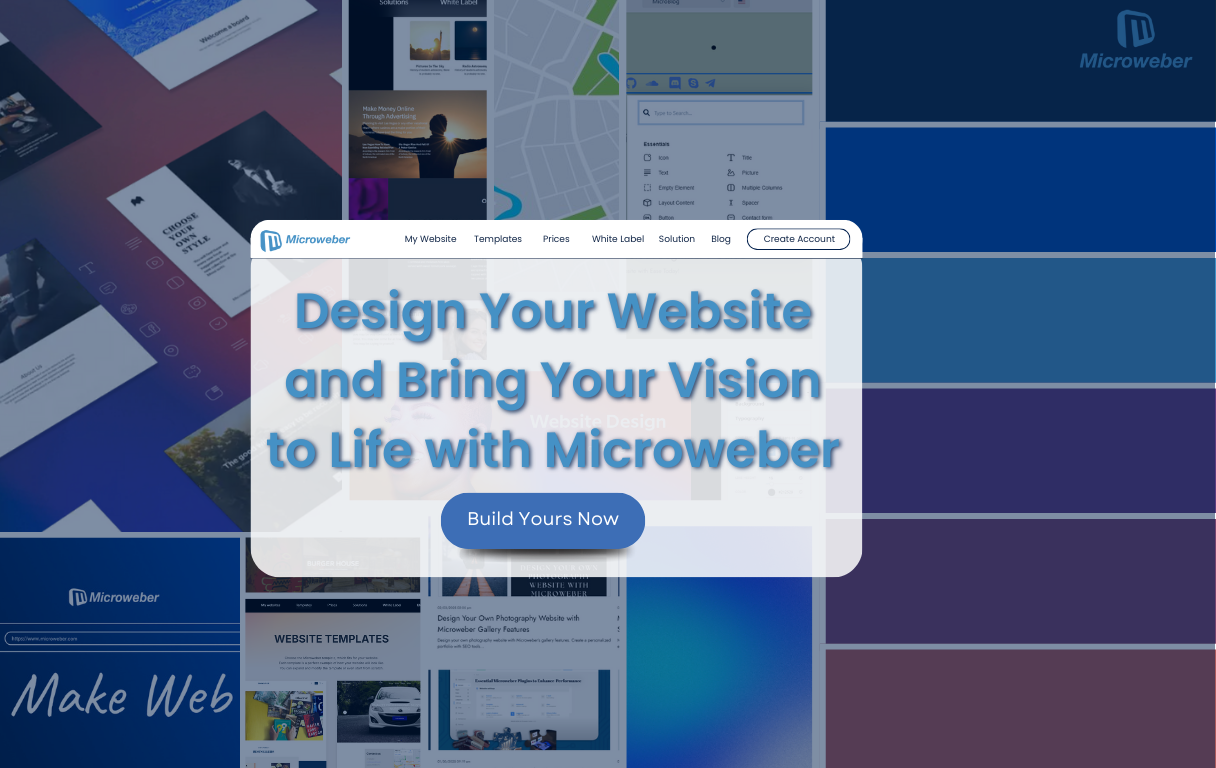 Building a website represents your chance to build an online presence that truly represents the essence of who you are or what business you're in.
It’s not just a matter of selecting a template and inserting some basic text, but rather a matter of conveying your brand, highlighting your portfolio, and developing an experience that resonates with visitors long after they’ve left the site.
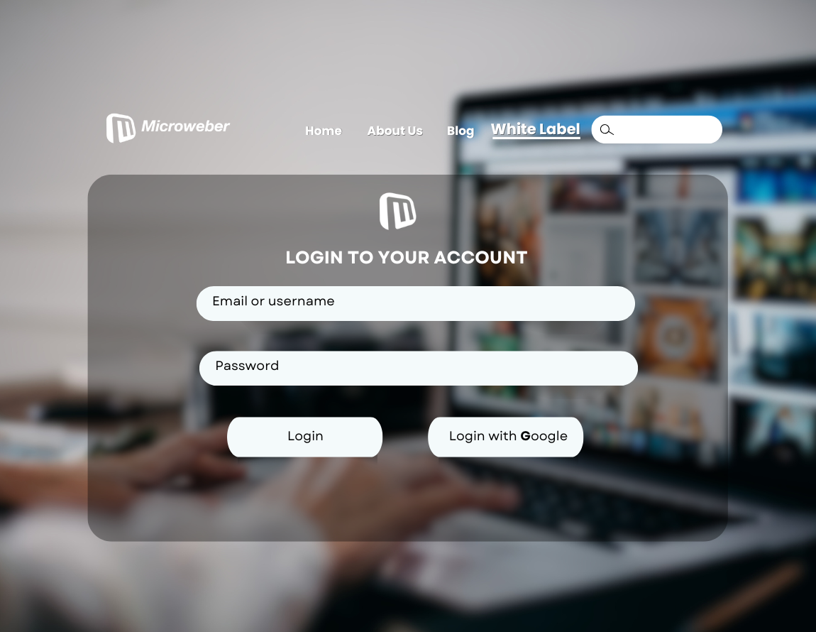
Microweber gives you all the tools needed to build your website in your style, without having to possess any coding skills or major tech knowledge.
Microweber makes it easier for you, as a designer, artist, or entrepreneur, to bring your website design ideas to life, all thanks to its seamless layout and flexible features.
Are you ready to bring your vision to life with a stunning website?
Unleashing Design Freedom for Creatives
Your web design forms the cornerstone of your web presence. Layout, typography, color schemes, and everything else about a website's look and functionality directly impact users' interaction.
Whether you’re building a simple portfolio or an operational business website, Microweber equips you with all the tools needed to build a trendy yet functional design.
Being able to create exactly what you want, with no holdback, puts you in a position to succeed.
Drag-and-Drop Builders: Empowering Users with Real-Time Design
With the ever-evolving technology, coding expertise is no longer needed to design your one-of-a-kind website.
With Microweber, the drop-and-drag editor and real-time design preview enable users of all levels to make layouts, sections, and elements personalization directly in live-edit.
Every change you make happens before your very eyes, so you see the results in real-time.
This unique feature speeds up the design process and reduces the hassle of back-end coding in the conventional manner.
The Impact of Typography and Color Schemes on User Engagement
Typography and color schemes are not only important in terms of making the website visually appealing, but both contribute significantly to how users understand and interact with your site.
Legible typography and a beautiful color palette are a guarantee that users will stay longer on your site and continue reading and interacting.
Microweber also features easily accessible typography controls, so you can select fonts that match your brand voice.
Couple this with color customizations, and you'll have the tools to build a robust, cohesive overall design aesthetic on your site.
Adding Animation: Enhancing Interactivity Without Coding
Animation brings a website to life by adding nice interactivity and focusing users' eyes on certain elements.
It is simple to add nice animations such as scroll animations, hover effects, and transitions without coding when using Microweber.
All of these interactive components will lead your users through your website while keeping them interested.
Crafting Engaging Galleries to Showcase Your Work
One of the strongest ways of building your website is by including a gallery to showcase your products, services, or work.
Microweber offers a number of gallery types, including grid, masonry, and carousel views.
These formats present your information in an engaging and useful manner, drawing users' eyes to what's most important.
Gallery Formats: Choosing Between Grid, Masonry, and Carousel Designs
Each type of gallery setting offers a unique experience.
Microweber offers its users the following galleries:
- Grid structure is clean and organized, great for portfolios and product presentations.
- Masonry layout works well with creative presentations like photography, where diversity of style and size exists among the content.
- Carousel galleries are perfect for showcasing multiple images under one scrollable container.
You've got all these gallery choices in Microweber, and it's only a matter of a few clicks to change between them.
Implementing Lightbox Effects for a Better User Experience
Lightbox effects allow your visitors to click on your photos in a gallery and view them in full size in the form of an overlay display that doesn’t make them leave your page.
This allows them to get more information about your content in a more detailed manner without breaking their site flow.
Essential Elements of Portfolio and Product Showcases
For creative users, might it be a website for your résumé or even your business, Microweber allows your main focus to be the star of the website.
A well-designed showcase is essential to give a great first impression. Might it be your past work experiences or your newest product, Microweber allows you to showcase it all with ease.
Seamless Media Integration for Enhanced Visual Storytelling
Visual storytelling is an excellent way of engaging your visitors and passing your message across.
With Microweber, adding media -be it videos, GIFs, or SVGs- to your website becomes simple.
Rich media adds more quality to your storytelling, and people will linger longer on your site.
Easy Uploads: Building a Robust Media Library
Microweber's media library allows you to upload and store various types of media such as images, videos, and GIFs, and embed these directly into your content with a single click.
Managing Diverse Media Types: Images, Videos, GIFs, and SVGs
No matter if you are uploading high-definition product pictures or videos, Microweber offers a seamless interface where all your media uploads are handled easily.
The platform even supports newer file types such as SVGs so your site remains responsive and displays sharply.
Streamlining Content Creation with Integrated Media Solutions
Having all your media in close proximity makes it easier and faster to build your content. Images, videos, or animations can simply be dragged and dropped into your website's layout.
Optimizing Media Performance for Speed and Efficiency
A speedy site equals success. Microweber won't allow your site to lag because your content is heavier than it should.
Instead, you can follow these simple techniques to know which file fits your website.
Image Compression Techniques for Faster Load Times
Microweber offers auto-image compression, reducing file size without sacrificing image quality so sites load as fast as possible.
Lazy Loading: Improving User Experience on Mobile Devices
On mobile phones, lazy loading only loads pictures after they become visible. Keeping your site at its optimum speed saves bandwidth and enhances the overall experience.
Responsive Design: Ensuring Seamless Experience Across Devices
With Microweber, your site will automatically become mobile-responsive by default.
The program assures your site will shift smoothly between desktop and mobile phone size to provide your visitors with the best possible experience every minute of every day.
Customization Without Limits: Making Your Website Unique
Whether you're developing a personal blog, portfolio, or business website, Microweber provides all of the tools required to personalize your website exactly as you require it.
Layout Freedom: Tailoring Designs to Fit Your Brand
Microweber allows total freedom to design your layouts so your website reflects your brand identity and becomes distinctive from others.
Brand Identity: Incorporating Logos, Colors, and Fonts
Microweber branding features enable everything to stay uniform on your website, ranging from logos to fonts and colors.
Accessibility Options: Ensuring Your Site is User-Friendly for Everyone
Microweber's accessibility features allow you to make a website accessible to all, including those with poor eyesight.
Simple features like contrast and font size settings allow your website to reach more people with greater ease.
Advanced Features for Power Users and Developers
For others who require more design and functional control, advanced features are offered by Microweber.
Custom CSS and JavaScript
If you possess coding skills, Microweber also supports custom JavaScript and CSS, so you can add complex animations or bring advanced features to your website.
API Integrations: Expanding Capabilities with Third-Party Tools
You can also connect your site with third-party applications and services via API integrations, e.g., payment gateways, social media streams, or CRM programs.
Maximizing SEO and Performance for Online Visibility
Good design is only the first step, visibility matters. Microweber adds SEO tools to make your site SEO-optimized so it shows up first on search results.
Built-In SEO Tools: Enhancing Search Engine Rankings
Microweber also features a number of SEO functionalities including meta tags, image alt-text, and SEO-optimized URLs to increase your website's visibility.
Mobile-Optimized Websites: Catering to Today’s Users
All websites created with Microweber are mobile phone-accessible by nature, targeting more and more users who are reaching sites via mobile phones.
Conclusion
Microweber gives you all the freedom to build your site exactly as you wish it to be, with no restrictions anywhere.
Whether you are an artist who wants to showcase your portfolio, an entrepreneur who wants to start an online business or a developer who wants full control over your site's design, Microweber gives everything you need to make your dream come true.
With its drag-and-drop builder, responsive web design, robust media integration, and natural SEO features, you can build an incredible website showcasing your brand in its entirety.
Want to turn your thoughts into action? Start building with Microweber now and unleash your site's full potential!
FAQs
How to design a website?
Use tools like Microweber to ease simple customizations, a drag-and-drop interface, and lots of design choices.
What are gallery website templates?
Gallery templates are templates designed to exhibit your products, portfolio, or work in an aesthetically pleasing way.
What are the four types of website design structures?
The four web page layouts are Fixed Layout, a fixed width and don't change; Fluid Layout, based on percentages and varies with screen size; Responsive Layout, self-adjusting to improve on whatever device one works on; and Adaptive Layout, where fixed layouts are used specifically for certain devices.
About the Author

Nada Allam
Hello, I am Nada, a Web Content Writer at Microweber, specializing in crafting engaging and informative digital content, to ensure an exciting and intriguing website building experience.
Share this article:
Related posts
6 Microweber Integrated Modules: Key Features and Benefits
Build a Thriving Local Directory: The Easy Way to Build a Website
Make a Website That Builds Trust: The Importance of Testimonials

Struggling With Conversions? 5 Common UX Mistakes You Can Fix Today
Create a Simple Website with Microweber: A Guide for Non-Tech Users